YOU'RE VIEWING

254 Beer District

254 Beer District

The Logo/A Blank Canvas/The inspiration

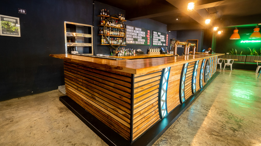
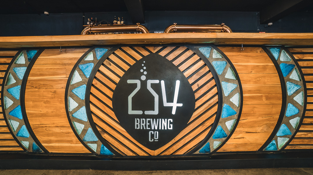
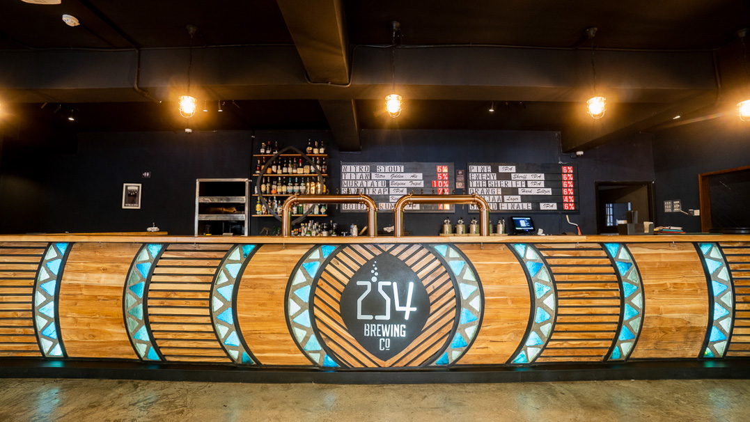
254 Beer District was created on a blank canvas. Our commitment to understanding the client’s brand, vision, and bar requirements set the foundation for the design that would meet their needs. The client’s logo features a shield design that served as the focal point for creativity. This central element is the visual anchor that bears symbolism in representing 254’s identity within the bar’s ambience.

A Music Venue & A Beer District

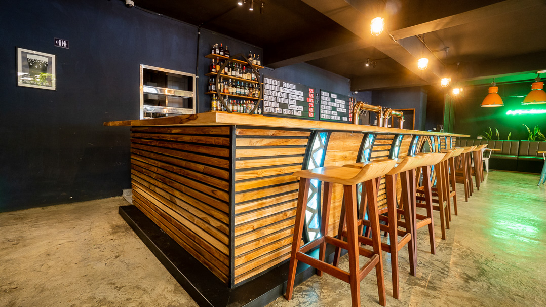
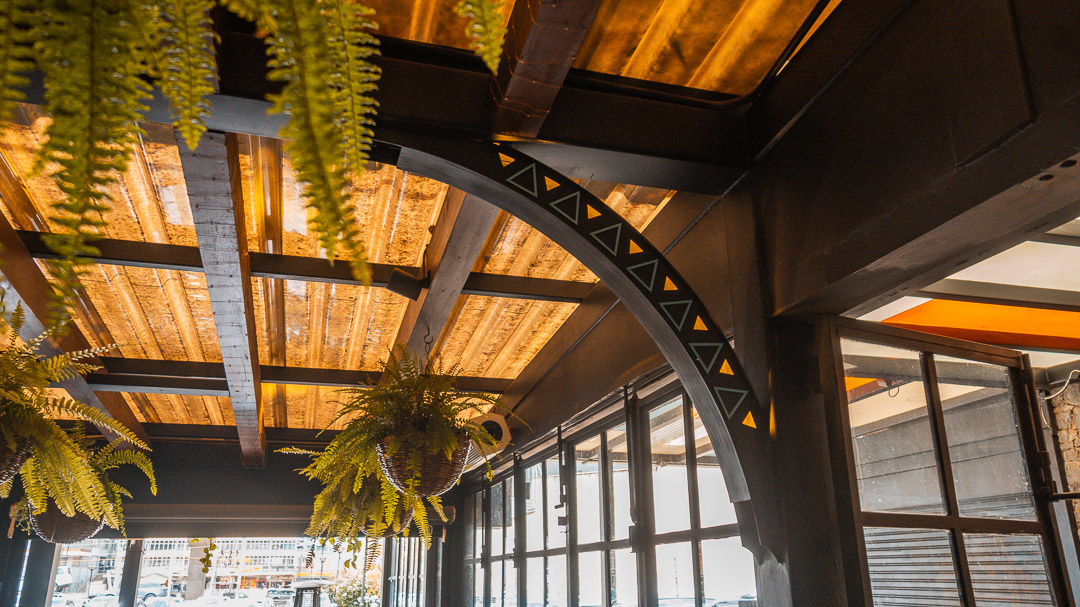
To align the design with the concept of music venue, we took a bold and innovative approach by incorporating the concept of sound waves. The brackets emanating from the shield and gradually increasing in size as they move away from it simulate the visual essence of a sound wave expanding. This captures the essence of music and provides a dynamic and engaging visual experience. Each sound wave is backlit, and we used triangles from the client’s logo for this purpose, adding a layer of depth and thematic elements to the overall design. We created a bubble-like effect in the glass, reminiscent of a glass filled with liquid. The interplay of light and shadow, combined with geometric shapes, creates visually appealing patterns. This symbolises 254 as a brewery, evoking the imagery of a frothy glass of beer.

Pillars of Continuity

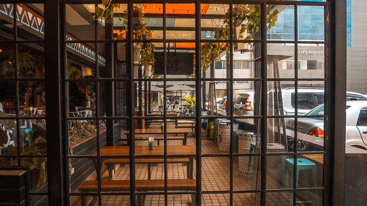
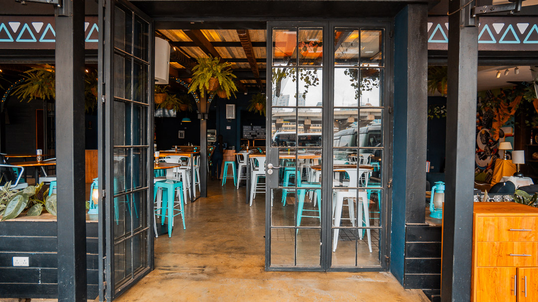
The incorporation of the triangles extend beyond the logo and onto the pillars supporting the Beer District. These ensure a consistent and harmonious design throughout the space.
An Illusion of Space

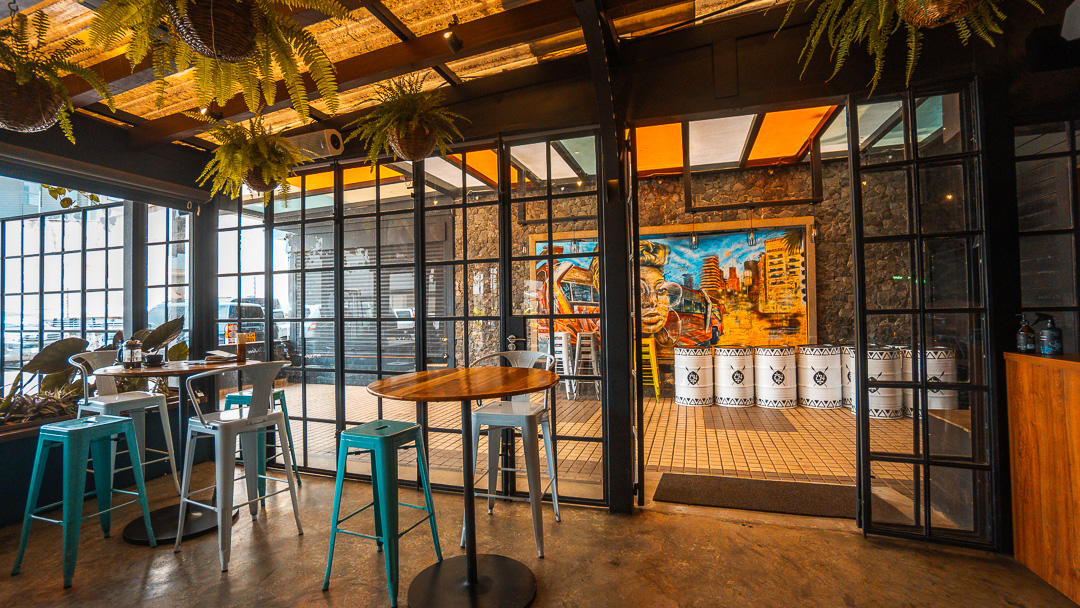
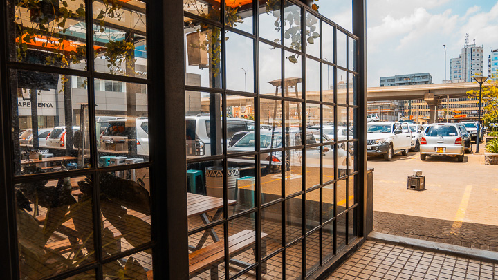
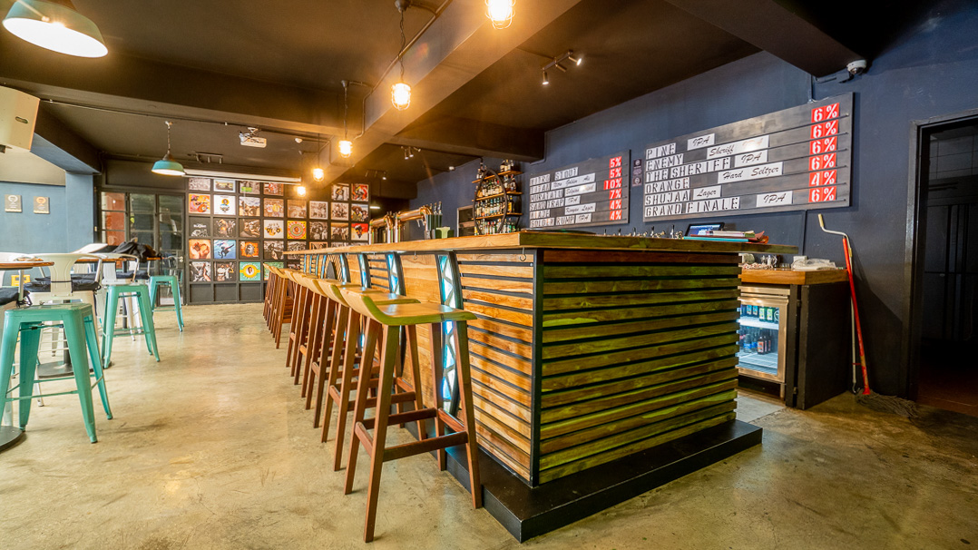
To enhance the space, we strategically integrated ample windows and glass doors, allowing natural light to flood in and offering a seamless connection to the surroundings. This created an inviting atmosphere that provides a visual link between the interior and exterior, making 254 a welcoming and vibrant space.